Values Make or Break Your Paintings
Review of the latest painting, "Camel Guide" and the importance of values.
Kirsten Meier
5/26/20243 min read
Values Make or Break Your Painting
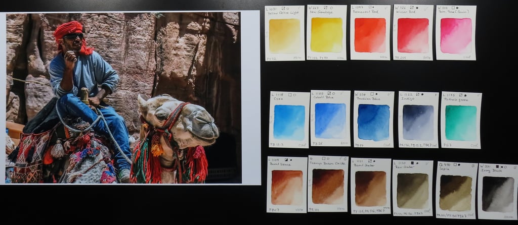
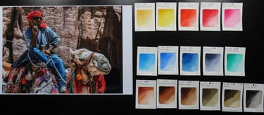
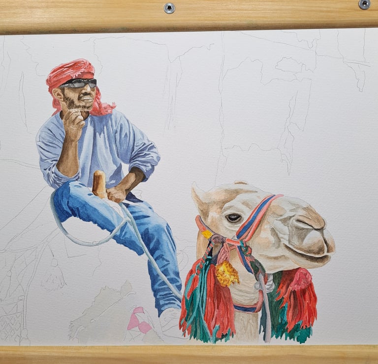
I found this great photo of a tour guide at Petra, Jordan. What really got my attention were the light and shadow contrasts in the guide's shirt and jeans. On top of that, the vibrant colors of the textiles and camel decorations, and one has a great start for a painting. As I described earlier, based on the reference photo I selected my palette, then started to lay in colors.
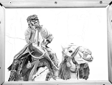
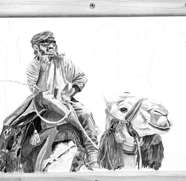
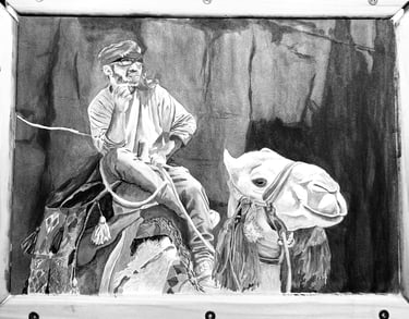
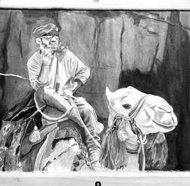
When the guide and camel were completed, I also checked values by changing the photo to black and white. Everything made sense, all shapes could be easily identified.
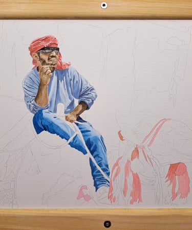
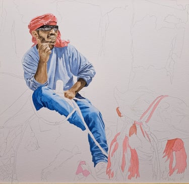

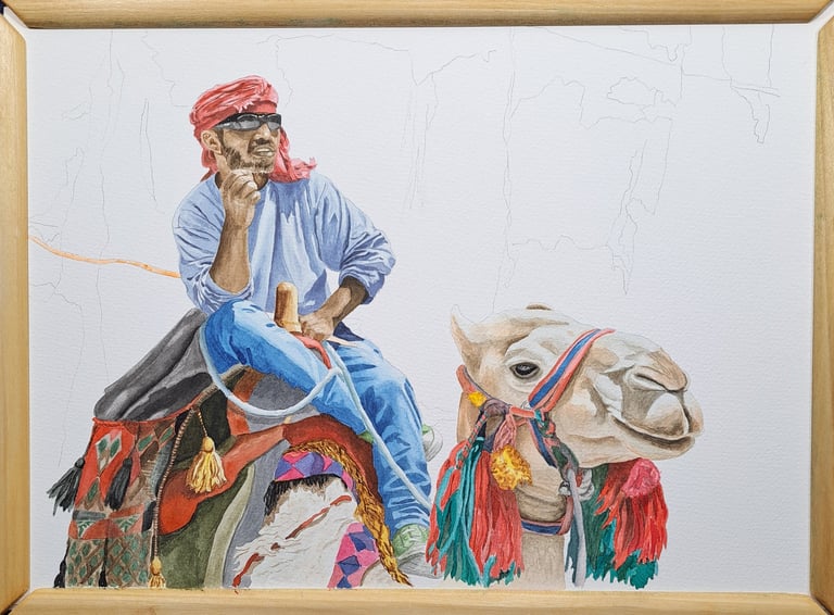
Then on to the background. The reference photo showed a rock formation, that was mostly in the same bright sunlight as the main subjects. And that's when my trouble started. In a photo the human eye can easily determine what is important and what is not, and I had fallen into that trap: I clearly saw the guide and the camel, and the background was, eh ja, background. When I laid in the colors from the reference photo, here is what I got:
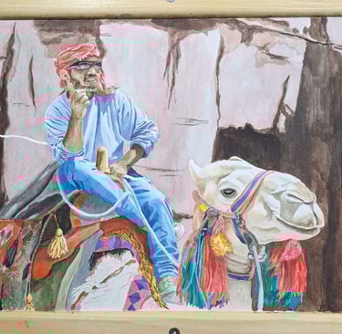
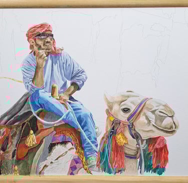
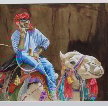
Yuck. The only part that still worked was the camel's face against the dark background. But the values of the rocks in the bright sunlight and the clothes of the guide were all a similar value. If I had reviewed a black and white version of the reference photo, I would have known from the start that I needed to either pick a different background, or not use a background at all. Now I was stuck with a staining color that could not be washed out - I could only go darker. And that's what I did: slowly, adding one light wash over another until I had the value that worked. I also checked with a black and white photo. Final step was checking all values against each other: Guide's right shoulder is in the cast shadow of his head, needs to be darker than left shoulder. Camel's top of head has full sun, other parts need to be darker. And so on.
In hindsight: there are a lot of good things to be said for doing value sketches even so they feel like a big waste of time. Mmm.... value sketches vs. four more layers of applied paint. I think the answer is obvious.
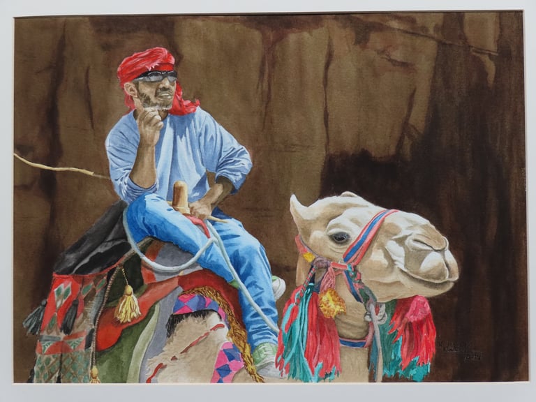
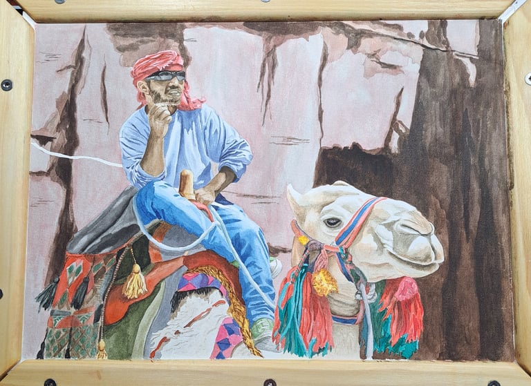
Camel Guide, 2024, watercolor, 11x15 inch