Watercolor Portrait - How "Morgan Freeman" was Created
Description and photos of creating a watercolor portrait of a famous actor.
Kirsten Meier
5/8/20243 min read
Watercolor Portrait: How “Morgan Freeman” was Created
Today I dropped my companion Milo (a 10 year old labradoodle with a huge heart) off for a sleep-over with his buddy Oliver. Back at home, the house is terribly empty without his clicking of nails on the wood floor, the clinking of the dog tag on his collar or the swirling noise of the doggy door. What is one to do? Studio Time!!!
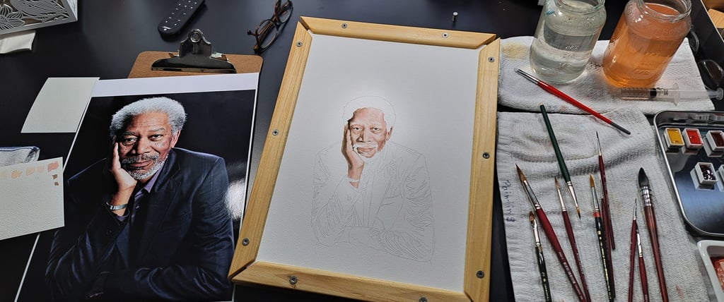
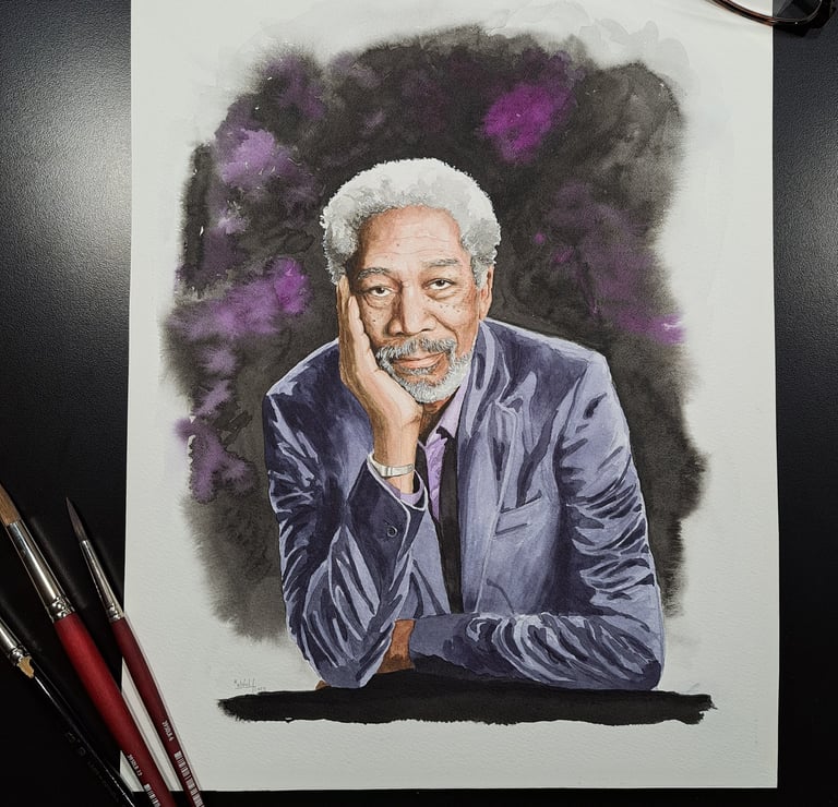
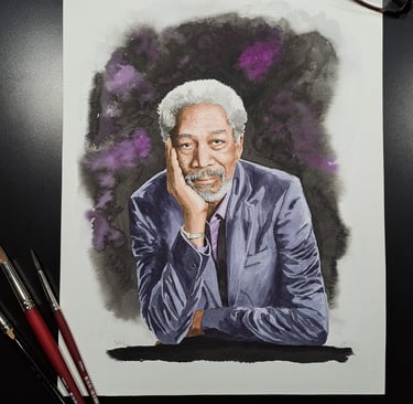
When I researched for good photos for portraits, I also came across a photo from Morgan Freeman, that intrigued me: posture, lighting and limited palette of blue-greys and violets and his beautiful skin and hair tones.
First choice goes to transparent colors, supplemented with hues I need; W= Winsor Newton, L=Lukas, D= Daniel Smith and Q=QOR. In this case I chose for the skin tones Yellow Ochre light (L), Mayan Red (D), Perylene Maroon (W), Quinacridone Gold deep (Q – not used), Burnt Sienna (L) and Burnt Umber (L); for the hair Ivory Black (W); for the jacket Payne’s Grey (L) and Indigo (L), the shirt Quinacridone Purple (D) and Cobalt Blue (W); and the background Quinacridone Purple (D) and Ivory Black (W). Touch-ups were done with White Gouache by Winsor Newton.
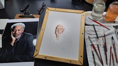
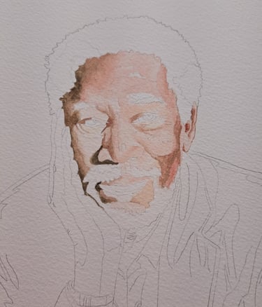
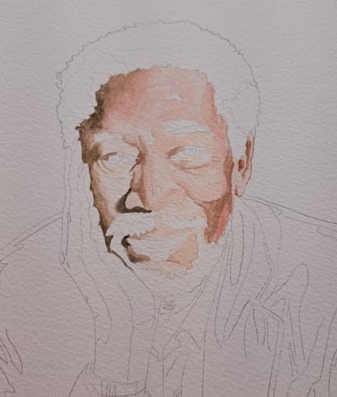
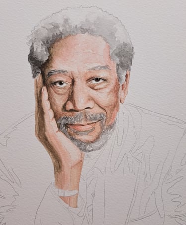
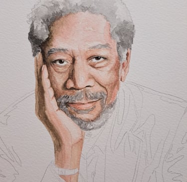
After transfer, I like to start with the most difficult part, in this case the face. I lay down light washes of the appropriate hues, but 1-3 value steps lighter than what is needed. Color can only be judged correctly when it is surrounded by other colors, so to me this is a constant process of glazing layers of hues to adjust chroma and value, all the time making sure to keep edges soft.
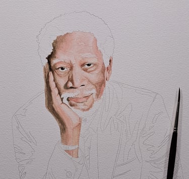
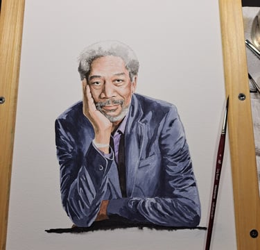
I am very pleased how the face and hair turned out. On to the jacket, but this time in a rough, textured style to let the smooth and detailed features of the face take front and center stage. Finishing up with wet-into-dry and wet-into-wet techniques for floating on the background. A critical review of final values, applying last glazes and touch-ups.
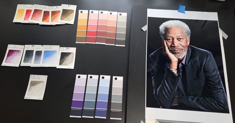
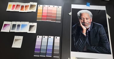
I printed an enlargement and the first step for me is to pull out all the colors I see in the photo. For that I use a Magic Palette® Color Matching Guide. Then I decide how I translate those colors to watercolors I have available and create my palette.
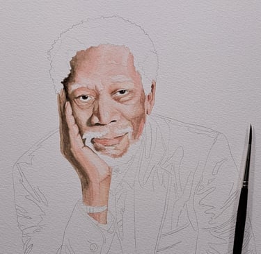
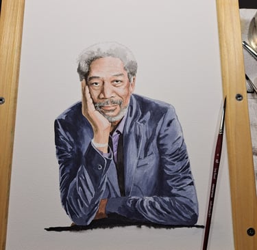
Voila – “Morgan Freeman”, a very handsome representation of a great actor.